
A Look at Interfaces
As we start a new semester and have new classes it is always exciting and nerve-racking to jump in head-first with new professors and in many cases, new classmates. I feel very fortunate that my cohort is so small and that I have all of the same people in my classes. So far I have really loved the start of this semester, we have looked a lot at interfaces that work as well as some that need work. Each member of my class had to make a presentation based on four different interfaces: one that works, one that needs work, an interface with a physical component, and an interface that has improved a lot. I have really enjoyed this assignment because I have learned so much about different types of interfaces and technology, some of which I did not even know existed. Something I have found particularly interesting is hearing the improvements that each of my classmates has proposed for their interfaces that need work. I can honestly say that I have learned almost as much from the work of my classmates as I have from my professors up until now.
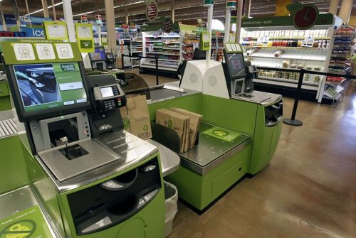
When we hear the word interface many people just think of apps or websites, but in reality interfaces are all around us. ATMs, self-checkouts, smart speakers, apps, video games…the list is endless! Since getting this assignment I have started noticing all of the interfaces around me, and it is astounding. As my interface with a physical component I looked at a self-checkout lane that you would see in the grocery store. I looked at the screen, the scale, and the accessibility. I compared self-checkouts from various stores and settings. It was really interesting to see what is uniform amongst these and what is unique and different. It really helps you think about what is working and what needs work.
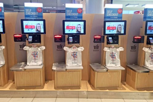
Here is an example of a very minimal and basic self-checkout
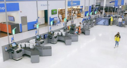
Here is an image of a more complex self-checkout lane. Here we see the extended counter space with multiple bags. It looks like you could check out here easily no matter how many items you are purchasing.
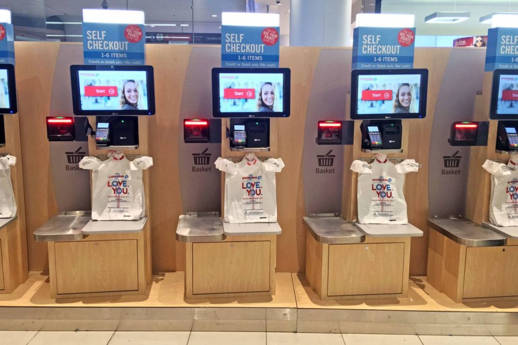
I included this photo to show a median self-checkout. This is more complex than the compact and minimal one, has less counter space than the complex one. It appears the most friendly with a colorful display.
If we start thinking about all the interfaces we interact with in our day to day life in this regard, we will learn so much about what makes a successful interface. We all have those pieces of technology that we do not prefer to use—mine would be a smart fridge. I had a smart fridge in a previous rental unit, and I always got frustrated when I accidentally reprogrammed it or when I pushed a button just trying to open the door. Looking back, I should have stopped to think of the situation as an opportunity to see how I would improve the design, to turn it into an interface that someone would look forward to interacting with.
Last semester I had all of the same people in my classes, so we got to know each other. This semester we get to see more of each person’s creative side right out of the gate. Yesterday, a classmate of mine did a great presentation where he made a visual prototype of the improvements he would make to the HomePod, a small Apple speaker. Up until this presentation I had never even heard of this product. Being able to see what he would improve upon to make this even better was so awesome. This is such a great way to look at the things that frustrate us. Instead of giving up on the next interface that frustrates you, try to take a moment and sketch out (either in your head, on paper, or digitally!) what you would do to make the interface more efficient and user friendly. Now you are feeling how a UX Designer feels!