What Does Preparing for a Thesis Exhibition Look Like?

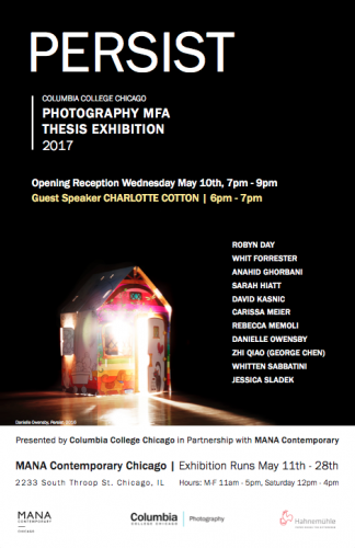
The graduating Photo MFA students are busy preparing for their thesis exhibition, this year hosted at MANA Contemporary, Chicago. Thesis is synonymous with “crazy-busy-hard-work,” but what does preparing for a thesis exhibition entail, exactly?
More madness disclosed under the cut!
Columbia College Chicago’s Photo MFA program cranks out some damn good photographers, and at the end of their time here, the soon-to-be-masters put on an exhibition of their work.
But it’s just photography, right? It shouldn’t be too hard to prepare an exhibition of photography, surely?
Hahahahahaha.

One of the wonderful things about the program is how yes, us students are photographers, but a lot of us also identify as artists. For most of us, it’s a lot more than pinning a print to the wall. We have to be extremely mindful and careful about how we display our images, taking into consideration the photograph as an object. In the current age of digital media, where most people never even print their photographs, it’s easy to forget such a crucial part of the process. But, when you’re in grad school, you gotta think about the print all of the time.
So, now that we’ve established that Photography MFA students freak out about how to put 2D objects on a wall…Just what does that process look like?
Step One: Figuring Out the Edit
You make a lot of work in grad school. A LOT. A LOT A LOT.
But, here’s the thing: you’re not gonna show all of the work in your thesis show, for a couple of reasons. The first is some of the work is bad. Harsh words, but it is true. Us hard working grad students make some really bad work during our time in school– and that’s okay! It’s all a part of the process. The second reason is you have limited space to show your work, so you have to pick out a few photographs from your stack to show.
It’s not as easy as it sounds.
The conceptual message behind a sequence of photos can change drastically if one photograph replaces another. There has to be cohesion in color, form, and subject matter. It’s tricky business, and all of us have spent hours upon hours in empty rooms, moving around work prints, calling one another and crying as we try to figure out “what photographs are the best photographs for what I am trying to say?”
Step Two: How The **** Am I Gonna Display These?
Once we have our edits figured out, the next step is to decide how to display the work. How about classic frames? Plexi mount? Pin them to the wall by one corner? Light boxes? Magnets? How about just throwing them on the floor?
Not all photography is created equal. Not all photography belongs in a frame, behind glass. For a master’s degree student, they have to consider even the conceptual meaning behind the display of their work.
See why we’re tired? We can’t just throw our stuff in frames and call it a day. We have to have a reason why for every last thing.
Step Three: Time to Hang… But How?
One of the last steps is figuring out just how to hang the work. I don’t mean with like, hammers and nails and such, but the organization of the work. Do you hang the work in a straight, linear line? Or a grid? Maybe salon style? This goes back to step one, when figuring out the edit. How we choose to hang our work has conceptual prowess.
The moral of the story here about preparing for a thesis exhibition?
EVERYTHING IS CONCEPTUAL AND EVERYTHING HURTS.
But man, that exhibition is gonna be hella.

Thanks, google, for the gifs.
