What’s the Poster?
[flickr id=”8388015315″ thumbnail=”medium” overlay=”true” size=”original” group=”” align=”none”]
“What’s the poster?”
Or in industry terms, the one-sheet. Our professor Karen Loop has informed us that this is a question Harvey Weinstein, for one, will ask when he is pitched film ideas.
Producing requires many skills. Some of which I’ve discussed here before, but one I’ve not really touched on is that of foresight. At any given time, on any given project, you should always question just who your audience is. You might produce a remarkable film, but what use is it if you don’t know who you’re marketing it to? From the early stages of development, you need to think about the following questions:
• Does the working title of this film indicate what the story is about?
• Does the logline draw your audience in?
• What’s the poster?
[flickr id=”8388015145″ thumbnail=”medium” overlay=”true” size=”original” group=”” align=”none”]
These marketing tools are often overlooked in the early stages, but if figured out from the get-go, they will help not only in terms of refining the product for its intended audience but also in pitching the film. In Blake Synder’s Save the Cat—which I previously recommended—Snyder has the following to say of the film poster:
Think about every Alfred Hitchcock thriller ever made – Rear Window, North by Northwest, Vertigo, and Psycho. Just mentioning these movies to a true fan evokes the pitch and the poster of each story… It’s a way to put yourself in the shoes of the customer, the person who’s paying good money to come and see your film.
Last week, I shared some roughly sketched concept art for my short film Kick Off, and someone since suggested that the poster should be modeled on the sketch. It got me thinking about film posters, or one-sheets, in general.
[flickr id=”8389103440″ thumbnail=”medium” overlay=”true” size=”original” group=”” align=”none”]
Lately, there doesn’t seem to be as much of a tendency to divulge story as there was in the past. Historically, film posters tended to cram a lot in. Take a brief look at posters for Jaws, Attack of the 50ft Woman, or The Good, The Bad, and The Ugly, and the story is more than evident. Nowadays, it is a different story. Flavorwire.com takes a look at thirty of the best film posters of 2012 here. The stark offering for Zero Dark Thirty, Prometheus’ chilling one-sheet, and Django Unchained’s understated effort all demonstrate a move towards a more minimalist approach, with emphasis on design. They might not necessarily give much away in terms of story, but they definitely grab your attention and, for the most part, sway away from the clichéd film posters that we witness far too often.
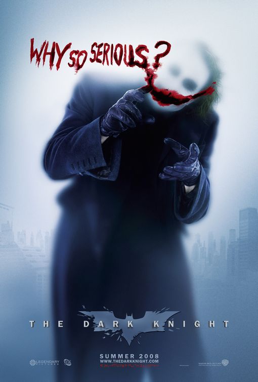
There were countless posters released throughout Christopher Nolan’s Batman trilogy, but my favorite film poster in recent years (pictured below) comes from the middle installment, 2008’s The Dark Knight, and features the now iconic image of one of Heath Ledger’s last great characters, The Joker.
Next time you develop a project, try to think beyond just the short-term. Think of your intended audience, how you will market your product to them, and maybe just ask yourself, “What’s the poster?”
[flickr id=”8389109574″ thumbnail=”original” overlay=”true” size=”original” group=”” align=”none”]
