Your website is a direct reflection of you as a brand, showcasing your talents & capabilities. It is the first place a potential client or employer will look before calling or meeting with you, so it needs to look professional, be easy to navigate & have strong, curated content. While Facebook pages & other Social Media type accounts are great places to distribute & display your work, they are only extensions of your professional presence, and not fully representational of your body of work.
What to Know Before you Start:
Websites are either custom built, or made using a template. If you know how to write code, building your own site is always an option, but can also be painful & time consuming if it’s not your forte. We recommend using template-based sites where the design & code are taken care of, & you simply upload your work, resume, & contact info.
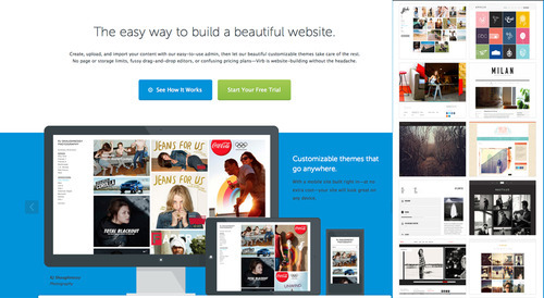
As a student, you have a free VIRB account for 1 year. If you decide to continue when the year is up, it’s $8 per month thereafter. You can also look at options from template providers like Yola, Squarespace, Carbonmade, WordPress and Tumblr. You can find direct links to these sites as well as web site hosting on our Where to Get Stuff Page.

VIRB has a variety of tutorials & getting started tips that you can find here.
What goes on your site can be tricky and must be in a digital format that you can upload. For info on how to photograph your work, visit our previous post on Why Do I Need a Portfolio?
For students, a great place to start is with simple headings like Home, Portfolio, Resume, About, & Contact. Keep in mind your website will always grow with you, & those heading will expand or change over time. For now, they are great place to start from.
If you’re using Virb, you’ll see they have a variety of templates where those headings can run horizontally across the top, or vertically down the side. This will be based on personal preference and how the navigation works with your content. The great thing about template portfolios is that you can always them without having to re-upload your work & info.
For specific help with what to put on your site and how to organize it, a meeting with your Creative Industry Liaison will help. We also have examples on our Pinterest site under the Websites board.
As you think about how your site will look, remember these main principles of a good website:
KEEP IT CLEAN & SIMPLE
Try to keep to 5 or 6 headings with drop-down menus underneath to keep the main page clean & simple. If there are too many categories on the site, the viewer is uncertain where to start and may leave before they ever see the depth of your work.
CONTENT IS KING
Depending on your industry, your portfolio may be centered around images, film or sound, text, or a combination of the above. Either way, be sure that each category section on your site has no more than 15-20 examples of your best work. If you need help editing, meet with your creative industry liaison.
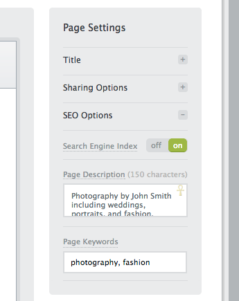
USE SEO KEYWORDS
SEO is Search Engine Optimization, and SEO keywords are words that you type in when you are “googling” something. For visual and performing artists, the most important keyword for you is your name! From there, you’ll want to make a list of words that describe you and your business/industry. Each page should have its own set of keywords. You can learn more on this topic on Virb and here,

TEST YOUR SITE’S FUNCTIONALITY
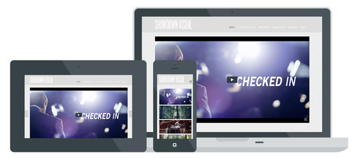
Email your site link to friends, family, faculty, etc. & have them review it & test it on different devices. You can also use a service like Peek, where your submit your site for a free evaluation by a member of their team. This type of feedback is invaluable as we are often to close to see what might be missing.

ADD WIDGETS
Widgets are pre-formatted areas of content like a Twitter Feed, your blog, Instagram, and more. Widgets can be added to Virb sites to help your visitors easily recognize your social media icons and directly link to those site to follow you.
UPDATE
Keeping your work up-to-date on your site will also keep your visitors coming back. Try to add new work as often as you can. Your online portfolio is a continual & ever-changing body of work that your clients like to see. So expand, grow, and update twice a year at the very minimum.
Your website is your brand online 24/7. It gives you a voice & instant credibility with clients while showing the extent of your capabilities. If you currently have a website, then you’re on your way. If you don’t, don’t worry, it’s never to late to start & we can help!


